Friday 25 March 2011
Thursday 24 March 2011
Feedback on Final Cut
POSITIVES :)
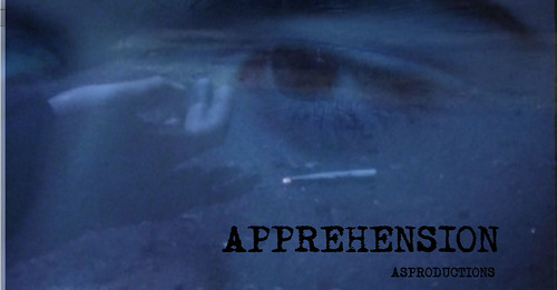
- The camera shot/zoom on the eye of one of the main characters is a good use of a thriller convention and gives us more of an idea that it's a psychological thriller.
- Loads of people loved out music because it creates tension and fits in with the editing. The music is also dramatic and emphasises the main character.
- The fading in and out of the the main character walking and him in his room is good because its in sync with the music.
- The dark location from the start gives a sense of fear and the lighting was good throughout.
- The close up of the characters was good.
- The use of the cigarette prop.
- The music and the camerawork together works really well.
- The time of day and the lighting added to the effect of the viewer.
- Parallel editing is very good.
NEGATIVES :(
- The camera work could have been more steady and the zoom shot was also unsteady and jerky.
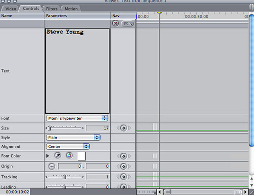
- The titles could have been clearer and maybe bigger.
- The ending could have been more clearer and visible.
- Could have made the strangling more violent and dramatic.
- A change in font was suggested and to improve the effects on the titles
- Improve the variation of sound and maybe use some digetic sound, change the tempo of the sound?
- End it at 1:40 when she drops the cigarette.
Tuesday 22 March 2011
Title Pane
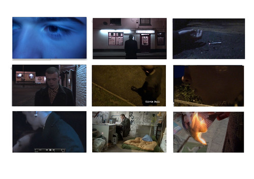
1) Lighting ting - We used artificial light to achieve this shot. With a torch above the camera held by the cameraman
2) Location tingaling - China Chef (area) is where we filmed the majority of our footage. We used this run down area to make the audience feel uncomfortable and tense.
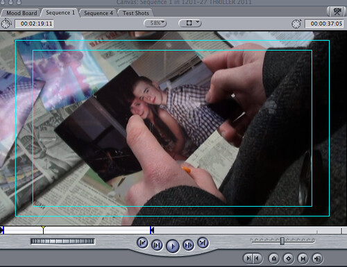
3) Props ting - The lit cigarette shows that someone was using it and now isn't, therefore we are showing that they are dead without showing too much blood and gore etc.
4) Bling bling - Phil's long coat shows that he is a dark and mysterious character.
5) Camerawork ting - High angle shot that we achieved by lifting up the tripod, teamwork!!!!!! This also hides his identity, creating more mysteriousness.
6) Cameraworking - Close up, still hiding his identity
7) Thriller Convention ting - The murder. One of the thriller conventions is that it is based around a crime.
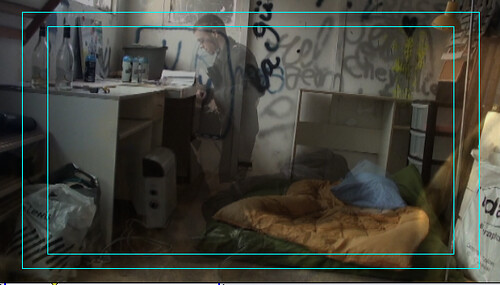
8) Thriller Convention ting - The graffiti in the room makes the audience feel uncomfortable.
9) Thriller Convention ting - The burning of the picture shows the protagonists flaws.
Friday 18 March 2011
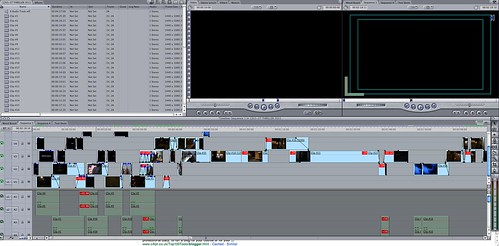
FINAL CUT!
We were given feedback from Andrea and her co-worker about adding a sound effect over the strangling scene, be we decided against thier advice because the main character is supposed to be apprehensive of his actions and also the music already had a subtle tension building tone to it.
Monday 14 March 2011
U1 26 analysis
Editing: I like the titles. The first scene feels a bit long. Then the pace of the next couple of scenes goes a bit faster. The match on action scene is very good although the main character holds on to the door handle a bit too long.
Camerawork: This film uses a variety of shots. It starts with a high angle shot of the pictures. I think you should include more shots from different angles maybe some close ups of the pictures that are more important to the narrative so we can see them better and focus on the story line.
The film then cuts to a panning of a bedroom this is quite good but seems a bit out of place.
Then there's a shot of someone's feet as they are walking; This is a very good shot to introduce to the story and character. The next shot is very good because it uses match on action.
You could have used a wider variety of shots and shot angles to make the film more effective and dynamic!
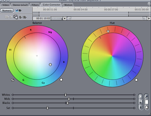
Mise en scene: The lighting on the first scene isn't very good and you can't quite see what is in the scene. Maybe you could use some colour correction to make it brighter so the audience can see the pictures.
The prop you used of the outline of the girl is very good and adds a huge twist to the film making it an exiting thriller. I like the titles.
Sound: The film seems like quite a dark film yet the soundtrack you have used seems very happy and fast paste in contrast to what was happening. If I were to edit this film I would have put the same orchestral music type but at a much much slower paste.
Thriller conventions: You never see the main characters identity which makes the intro even more mysterious and look more like a thriller. The unrealistic storyline and the abnormal situations this intro gives to these characters make the viewer interested and want to know what happens next.
Friday 11 March 2011
Friday 4 March 2011
What did we do today? (Fri 15:33 - 04/03/11)
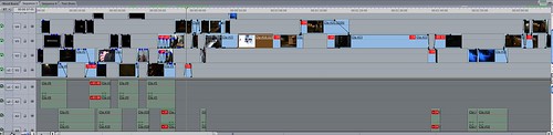
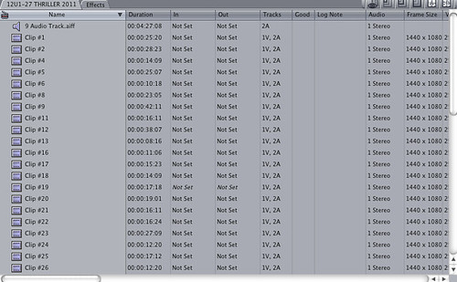
Me and Steve finished editing our clips together. All we have left to do for next week is to add the music and sound effects.
Tuesday 1 March 2011
What did we do today? 1 3 11
It's Steve's birthday, so we decided to do something incredibly exciting, MORE EDITING of your sequence! Adding in loads of effects such as glow and speeding up clicks!
pictures to follow
pictures to follow
Subscribe to:
Posts (Atom)